The making of this website
Howdy! Independence is a hot topic in my circle; I always like to own my things. Since ages, I used to daydream about owning a private space where I can express myself without barriers and without being digitally homeless. Conceptualizing my website took lots of tinkering, and the more I kept looking for inspiration, the more my design philosophy kept getting damaged.
Learning HTML and CSS took no more than a weekend, heck it was super easy since I have lots of \( \LaTeX \) background, I think every student should consider investing a bit of time to learn it. HTML/CSS can be pretty much used to express pretty much anything, I remember seeing people online mentioning that CSS can be used to create lots of hardcore 3D animations, something which prompted me to believe that front-end developement is bound to the human's creativity.
Although I have an artistic vision, I lack the knowledge set that is taught through these graphic designing courses, which sadly plagued my browser cookies and ruined my algorithm for a couple of months. I wanted something simple, yet part of me always wanted to have much more customizability. Sadly, trying to match the two challenges my perfectionism, especially as a person who just got into front-end developement.
My very first design (Warning: a song will play upon loading the page) was more than just a draft for my learning phase, I held an important emotional value to it.
The header
To begin with, I was inspired by those old school websites, which were very nostalgic and minimalistic. I planned to name it Applethal's junkyard. I used Adobe's colour wheel to pick the colors that work well with my taste.

The original header
First let's discuss the font, I chose PT Sans, I discovered it as I was writing my first scientific homeworks for the university since it was imposed upon us. I liked how compact and simple it looks.
The background's colours were recommended by Adobe's color wheel, since my favourite color is the dark Grena (#753649).
The text on the right was a placeholder, it had the intended content. Clicking on the first sentence would redirect you to Guns N' Roses' Welcome to the jungle.On the top left one may sight a song player, this one has by default plays Melty Blood: Type Lumina - Waiting Room. I felt that this song would match the feeling of my writing style thanks to its relaxing rythmic loops.
I don't have much to say about the buttons, At first I thought about eliminating the "About" section but then I thought that I could use the section to advertise myself much better than giving people my contact data.
The body
I wanted a blog sort of things to act as the face of my website

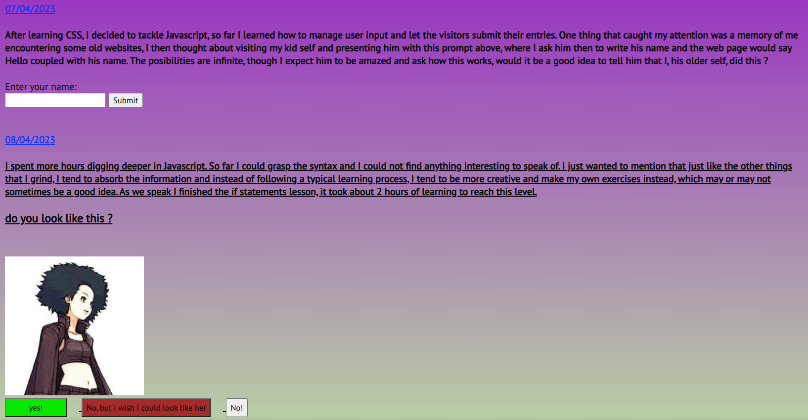
The original body
On the right hand side, you would see a small rubrique that has some of my online profiles, clicking on any of these would send you to my profile on their respective platforms. Hovering the mouse on RoRo's combat pod logo would spin it. On the very top is a quote inspired by one of Invoker's rare responses.
On the left, there would be posts which would spawn each time I... add a post... Yeah, they would have no other purpose. For exercising purposes, these would contain my insights and some small tweaks from the lessons that I have learned.

Some Javascript schenanigans
I want to direct your attention to the bottom post. I like Kat, I wanted later to use that small snippet as a joke gatekeeper, clicking on any of these responses will display a browser message. Originally, I thought about making it so that clicking on the wrong answer would block the visitor's access for a couple of hours.
What caused the original design to become what you see right now
Working on the website while also dealing with other responsibilities led me to burn out, I took a break, a long one
I might add.
After the summer 2023, I decided to give it another shot, while also revamp the design. The reason for the latter is that through out the time I spent surfing the internet, my designer eye kept getting altered. I ended up tinkering a bit more and decided to follow no trend, but to make my very own layout.
The colour palette are in
harmonie with the ladybug insect, which is part of the gimmick of my character... Let me present you with a small
linguistic lesson:
My real name Saad (in Arabic: سعد), depending on the context, means luck. Ladybugs symbolize that aswell in some cultures. Funnily enough I ended up choosing to deepen my studies in operational management, which uses combinatorics, probability and statistics as a basis. This decision has nothing to do with the aformentioned gimmick by the way, it was a pure coincidence.
I took then the time to research the appropriate colour palettes that would synergies with the insect and that's how I came up with what you currently see. Clicking on the lady bug enables dark mode.
Things went okey for a couple of days as I kept editing the HTML and CSS of the website, until I made it to a point where I felt that there could be an improvement to my potential workflow, which would involve me adding articles here and there, a process which would take lots of effort with the limited knowledge that I had back then; and that's how I discovered Hugo on the 9th of January 2024!

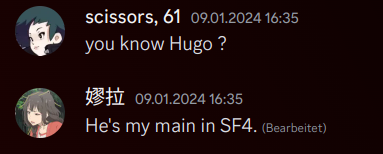
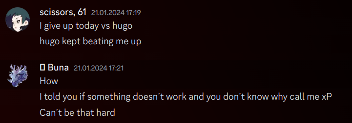
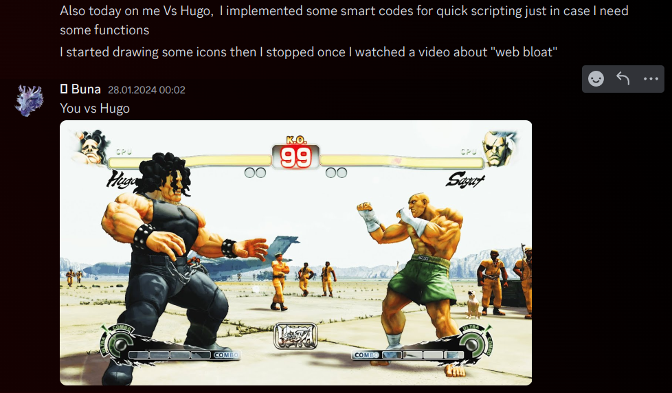
How it started. For context SF stands for Street Fighter
Learning Hugo was a bit intimidating. Going through the documentation used to spook me, until I contacted a friend
of mine who was kind and offered me some of his time, I took it to observe how he navigates the documentation pages to
get to what he needs. He could pull this off without having any prior experience with the framework itself, which
hinted towards the fact that: All it takes is to read the documentation.
Hugo would suit the purpose of my website, since all what I will be doing is uploading articles and pictures,
that's it!
Although their documentation was nicely written, I still had to deal with some barriers, namely the Go language. Learning some of its syntax helped me not only to deal with my needs, but it enabled me to add lots of gimmicks here and there in the website in conjunction with Javascript.
I could've always looked up online for templates and used them, and even if I could manage to find one that appeals to my content; something kept bugging me in my head about how "this corner looks ugly" or "how this section is unecessary". In the end, I chose to make my own theme from scratch.

Not a street fighter reference, for once
At first, I thought that I would be capable of achieving all of this within one night, and oh boy how wrong was I. The correct and healthy workflow would be to divide tasks and slowly progress through syntax hell.
Almost everyday, I would update my friend on my progress, as I read our past conversations, I would get some positive inner reinforcement that show'd me the walls that I with his help could manage to jump... So much so that one day he said the following:

How it ended! Maybe I should make a fanart out of this interaction
Overall, most of my activity involved me working on setting up an automation workflow, where I simply push updates to the website's repository and pretty much see the magic happens. I would like however to stress out that my perfectionism has slowed me down for some time as I kept tweaking the system, once I notice a mistake, I impulsively attempt to correct it before moving forward.
With that said, I welcome you to my website! I hope you enjoy the articles that I will be putting here! I would like to thank everyone who helped the making of this beauty, without their efforts, not only I would not be capable of displaying this article, but I also would not gain the experience and confidence to evolve as a person. It is important to build a structure and trust the process!